Perspective
I was just cycling home from the Bob Mould concert at the Corner Hotel, with an extra ring in my ears beyond the usual tinnitus, when I was reminded of something, that I dwelled on for the rest of my ride. It was just another rental truck…
20 years ago I was working in my father’s home office, while studying architecture in Auckland. One of his clients drove up onto the lawn, unannounced . He was called Duncan I think, quite a lovely man. He wanted to give his company’s logo a quick overhaul, and for some reason thought his architect was the best place to go. My father and I assisted him for about an hour, and then he was off, with some coloured pencil sketches on the back of recycled paper. He thought the current logo was a bit Seventies, heavy, and dated. We helped him add the colour and sense of distance to it that he wanted. Though I had my reservations, as the old Budget Rentacar logo was one of my favourites. I’m not sure who did what, as it was a while ago.
Even further back, in 1986, I was doing work experience in an advertising studio responsible for the local Ansett account. I can’t remember any stand alone graphic design studios at the time. They put me in a corner with coloured pencils and asked me to come up with an ad for Ansett. I went for something with a little perspective, a runway. Not too uncommon in the 80s, as I did like triangles. I’ve just realised how uncannily close to the ‘new’ Budget logo it was. There is some extra irony as Bob Ansett used to own the Budget brand in Australasia.
Maybe I was more involved that I remember in the ‘renewal’ of one of my favourite logos. I would like to think I was at least responsible for the retention of the old font, which I vaguely remember arguing for. That was the beginning and end of my graphic design career. Anyway, now I am reminded of that sunny morning in a suburban Auckland office every time I see that logo, pasted on trucks all over the globe. Funny how the tiniest things you do can end up following you for a long while.
Googling for images of the logos, I found out that it was just been updated again, for the first time in ages. Now the font and the colour have gone. Looks a bit weak to me.
Budget 1970s – best I could find – it was black with orange strips representing tire tracks.
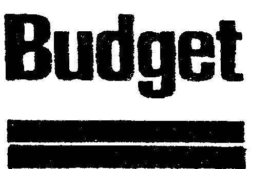
Budget 1993 – straight outta Milford, Auckland
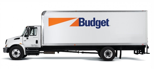
Budget 2012 rebrand

- By the way, I have no idea why the Auckland office was able to rebrand the company. I think it was a moment in time when the power in the corporation swung over this aways.
- Dad if you’re reading, please feel free to correct me!
Posted by Peter on 14.03.13 in graphic designers
comment
Commenting is closed for this article.