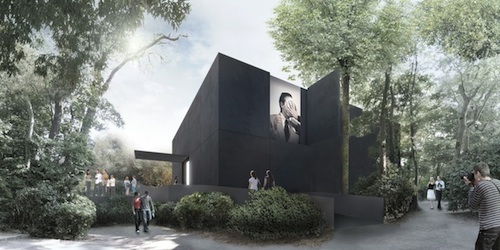
Black box
Denton Corker Marshall have won the limited competition for the Australian Venice Biennale Pavilion. There is a fair bit about that competition within these pages. Myself and about 750 architects protested against its conditions, which basically limited it to larger companies with overseas experience and experience in similar buildings. This wasn’t to be a pavilion that would take any risks.
In June, the commissioner for the Australian 2013 Venice Art Biennale, Simon Mordant, announced the competition and antagonised the nation’s architects by stating, “This is an art space. It’s not an architectural competition … We need a functional exhibition space that works for the artist and complies with the Venetian authorities’ requirements. And that’s going to be something that’s far more modest.” Mr Mordant is also donating $1M towards the $6M construction budget.
Denton Corker Marshall have read the writing on the wall, designing a stealthful black box that sucks in the light. It is not reflective, and doesn’t want to be anything other than the container Mordant asked for. This appears to be a building trying to disappear, in a terribly elegant way. Whether that’s the right thing to be doing in the canal-side backlot of a garden full of expressive national pavilions, is debatable.
Upon entry into the black box, one will enter a white box. The architects say that they have, “avoided imposing a mannered architectural ‘event’ on the artworks displayed within, rather creating a container on and in which ideas can be explored where the container in no way competes with those ideas.” It could be seen as the polar opposite of Sverre Fehn’s Scandanavian pavilion, also chosen at a limited competition. That building provides a platform to be filled, opening out in two directions to the gardens. That building is beautiful and very obvious, but, like Mies’ National Gallery in Berlin, it is a hard one to hang paintings in. DCM’s building borrows more from the numerous older pavilions decked out in generic neoclassical garb, and housing plain white rooms with four sides.
The DCM building can be read as a discrete and perfect box for the architecture-averse Australia Council. Even the architects say it was conceived as an object rather than a building. But it can also be read as a protest against the silencing of Australian architects, a darker and angrier statement about the state of things. Perhaps a black armband was just what we needed.
PS
Denton Corker Marshall is becoming quite adept at invisible buildings. In 2009 they designed the building that no one wanted, but everyone needed – The Stonehange Visitors Centre. At the time, London director Stephen Quinlan hoped that, “if a visitor can remember their visit to the stones but can’t remember the visitor centre they passed through, we will be happy.”
Posted by Peter on 04.04.12 in competitions
related:
tags: biennale, denton corker marshall
comment
Congratulations to the boys at DCM. A development of their Di Stasio competition entry. Who needs a new idea every Monday morning. Good pencil graphics. Barrie Marshall is still the best delieator to have come out of Springvale. I particularly liked the barge view on the Bacino, an appropriate nod to Aldo Rossi. Not fast enough for my taste though.
by David White on 4 April 2012 ·#
That should be “delineator”.
by David White on 4 April 2012 ·#
That’s almost as interesting as Seans’s bar fridge. I suppose it’s a fair comment on Australia’s relevance… Heatherwick was lying through his teeth, but it doesn’t hurt.
by WOFTAM on 7 April 2012 ·#
pg 480-481 Content. R. Koolhaas.
by info on 7 April 2012 ·#
Commenting is closed for this article.